Quick summary
Summarize this blog with AI
Introduction
In recent years, we have been assisting individuals transitioning into the data science and general data analytics field. A common question that arises is: “What types of analytics tasks can be expected in an entry-level data analyst or data scientist role?” This article aims to address this query by providing an overview of the typical data analytics tasks that junior data scientists and analysts are likely to encounter in the industry.
1. Descriptive Analysis
Descriptive analysis is the simplest form of data analytics. It involves summarizing and describing the main characteristics of a dataset. This can include calculations such as the mean, median, and mode, which help to provide an overview of the data at hand.
Descriptive analysis can give you a general understanding of the dataset, allowing you to identify trends or patterns and make comparisons across different data groups.

Code for the chart:
import seaborn as sns
import matplotlib.pyplot as plt
import pandas as pd

def mychart(sales_data):
    # Calculate total sales and average sales per category
    total_sales = sales_data.groupby('Category')['Sales'].sum()
    average_sales = sales_data.groupby('Category')['Sales'].mean()

    # Calculate sales distribution
    sales_distribution = total_sales / total_sales.sum() * 100

    # Sales trends
    sales_trends = sales_data.groupby(['Month', 'Category'])['Sales'].sum().reset_index()

    # Set seaborn style
    sns.set(style="whitegrid")

    # Plot sales distribution
    plt.figure(figsize=(12, 6))
    sns.barplot(x=total_sales.index, y=total_sales.values)
    plt.title('Sales Distribution')
    plt.xlabel('Product Category')
    plt.ylabel('Total Sales')
    plt.show()

    # Plot sales trends
    plt.figure(figsize=(12, 6))
    sns.lineplot(x='Month', y='Sales', hue='Category', data=sales_trends)
    plt.title('Sales Trends')
    plt.xlabel('Month')
    plt.ylabel('Sales')
    plt.legend(title='Category')
    plt.show()

    print(f"Total Sales:\n{total_sales}\n")
    print(f"Average Sales:\n{average_sales}\n")
    print(f"Sales Distribution:\n{sales_distribution}\n")

# Sample sales data
data = {
    'Category': ['Smartphone', 'Laptop', 'Tablet', 'Smartwatch'] * 12,
    'Sales': [500, 300, 200, 100] * 12,
    'Month': [1, 1, 1, 1, 2, 2, 2, 2, 3, 3, 3, 3, 4, 4, 4, 4, 5, 5, 5, 5, 6, 6, 6, 6, 7, 7, 7, 7, 8, 8, 8, 8, 9, 9, 9, 9, 10, 10, 10, 10, 11, 11, 11, 11, 12, 12, 12, 12]
}

sales_data = pd.DataFrame(data)

# Call the visualization function with the sample sales data
mychart(sales_data)
For example: you were given a task of analyzing the sales data of a ecommerce store.
Imagine you manage a store that sells various types of electronic devices, such as smartphones, laptops, tablets, and smartwatches. You want to understand the sales performance of these product categories over the past year.
You collect the sales data and perform a descriptive analysis to summarize and describe the main characteristics of this dataset. In this process, you calculate the following key metrics:
- Total Sales: You calculate the total sales for each product category to understand the overall revenue generated.
- Average Sales: You find the mean sales for each product category to see which devices, on average, sell the most units.
- Sales Distribution: You calculate the percentage of total sales for each product category to understand their contribution to the total revenue.
- Sales Trends: You analyze the monthly sales figures to identify any seasonal trends or fluctuations in sales.
Once you collect those data, it’s time to share the insights, you will typically work with your manager and set up a meeting to share your findings.
In the presentation, you share the insights into the sales performance of each product category, identify the best-selling devices, and recognize any patterns or trends in the data.
These insights can help inform your inventory management, marketing strategies, and promotional activities to optimize the store’s performance.
2. Inferential Analysis
Inferential analysis takes descriptive analysis a step further by using a sample of data to make inferences about a larger population. This type of analysis often involves statistical techniques like hypothesis testing or confidence intervals, which allow analysts to draw conclusions about the entire population without having to analyze every single data point. For example, a survey of a small group of customers can be used to infer the overall satisfaction level of the entire customer base.
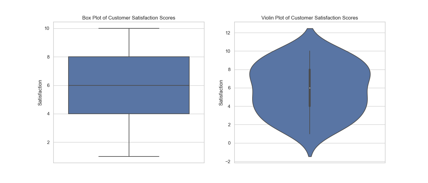
We can use python’s seaborn library and write a function to generate a box plot and a violin plot to visualize the distribution of customer satisfaction scores and calculates the confidence interval for the mean satisfaction score.
Code example:
import seaborn as sns
import matplotlib.pyplot as plt
import pandas as pd
import numpy as np
import scipy.stats as stats

def mychart(satisfaction_data):
    # Calculate the confidence interval for the mean satisfaction score
    mean_satisfaction = satisfaction_data['Satisfaction'].mean()
    sem = stats.sem(satisfaction_data['Satisfaction'])
    ci = stats.t.interval(0.95, len(satisfaction_data) - 1, loc=mean_satisfaction, scale=sem)

    # Set seaborn style
    sns.set(style="whitegrid")

    # Plot box plot and violin plot
    fig, axes = plt.subplots(1, 2, figsize=(14, 6))

    sns.boxplot(y='Satisfaction', data=satisfaction_data, ax=axes[0])
    axes[0].set_title('Box Plot of Customer Satisfaction Scores')

    sns.violinplot(y='Satisfaction', data=satisfaction_data, ax=axes[1])
    axes[1].set_title('Violin Plot of Customer Satisfaction Scores')

    plt.show()

    print(f"Mean Satisfaction Score: {mean_satisfaction:.2f}")
    print(f"95% Confidence Interval: {ci}")


# Sample customer satisfaction data
np.random.seed(42)
data = {
    'Satisfaction': np.random.randint(1, 11, 50)
}

satisfaction_data = pd.DataFrame(data)

# Call the visualization function with the sample satisfaction data
mychart(satisfaction_data)
3. Exploratory Analysis
Exploratory analysis focuses on exploring and visualizing a dataset to gain insights and identify patterns. This type of analysis is particularly useful when dealing with large datasets or when you’re unsure of what you’re looking for. By using techniques such as data visualization, clustering, or correlation analysis, you can uncover hidden relationships, trends, or anomalies that might not be apparent through other methods.

In this example, the pair plot displays the relationships between horsepower, weight, engine size, and fuel economy for a set of cars. By examining these visualizations, you can gain insights into how these features may be related, such as observing a negative correlation between weight and fuel economy, which indicates that heavier cars generally have lower fuel efficiency. This can help inform further analyses or inform decisions in selecting vehicles based on their fuel consumption.
Code example:
import seaborn as sns
import matplotlib.pyplot as plt
import pandas as pd

def mychart(dataset):
    # Set seaborn style
    sns.set(style="whitegrid")

    # Create a pair plot
    plt.figure(figsize=(12, 8))
    sns.pairplot(dataset)
    plt.show()

# Sample dataset
data = {
    'Variable_A': [4, 8, 12, 16, 20, 24, 28, 32, 36, 40],
    'Variable_B': [3, 6, 9, 12, 15, 18, 21, 24, 27, 30],
    'Variable_C': [5, 10, 15, 20, 25, 30, 35, 40, 45, 50],
    'Variable_D': [7, 14, 21, 28, 35, 42, 49, 56, 63, 70]
}

dataset = pd.DataFrame(data)

# Call the visualization function with the sample dataset
mychart(dataset)
4. Predictive Analysis
Predictive analysis uses historical data to make predictions about future events or outcomes. By employing statistical models and machine learning algorithms, analysts can identify patterns and trends that can be used to forecast future behavior.
For instance, we’ll use a dataset containing advertising budgets for different media channels and their corresponding sales figures. We’ll predict future sales based on the advertising budget for a specific channel.s an example of a simple linear regression model to illustrate predictive analysis.

We used the following code to create a scatterplot with a linear regression line fitted to the data, to find the relationship between advertising budget and sales.
The predicted sales for the test data are printed, showcasing the predictive power of the linear regression model.
In this example, retailers can use this simple predictive model to estimate sales based on their advertising budgets, which could help them optimize their marketing strategies and inventory management.
Code sample:
import numpy as np

# Modified sample dataset with added noise
np.random.seed(42)
data = {
    'Advertising_Budget': [100, 150, 200, 250, 300, 350, 400, 450, 500, 550],
    'Sales': [1050, 1375, 1860, 2250, 2820, 3120, 3670, 4050, 4425, 5130] + np.random.randint(-200, 200, size=10)
}

dataset = pd.DataFrame(data)

# Split the data into training and testing sets
X_train, X_test, y_train, y_test = train_test_split(dataset['Advertising_Budget'].values.reshape(-1, 1), dataset['Sales'].values, test_size=0.2, random_state=42)

# Create and train the linear regression model
model = LinearRegression()
model.fit(X_train, y_train)

# Predict sales using the trained model
predicted_sales = model.predict(X_test)

# Visualize the linear regression model
plt.figure(figsize=(12, 6))
sns.regplot(x='Advertising_Budget', y='Sales', data=dataset, ci=None)
plt.title('Sales vs. Advertising Budget')
plt.xlabel('Advertising Budget')
plt.ylabel('Sales')
plt.show()

# Print the predicted sales for the test data
print("Predicted sales for the test data:")
for i, prediction in enumerate(predicted_sales):
    print(f"Advertising Budget: {X_test[i][0]}, Predicted Sales: {prediction:.2f}")
5. Time series analysis
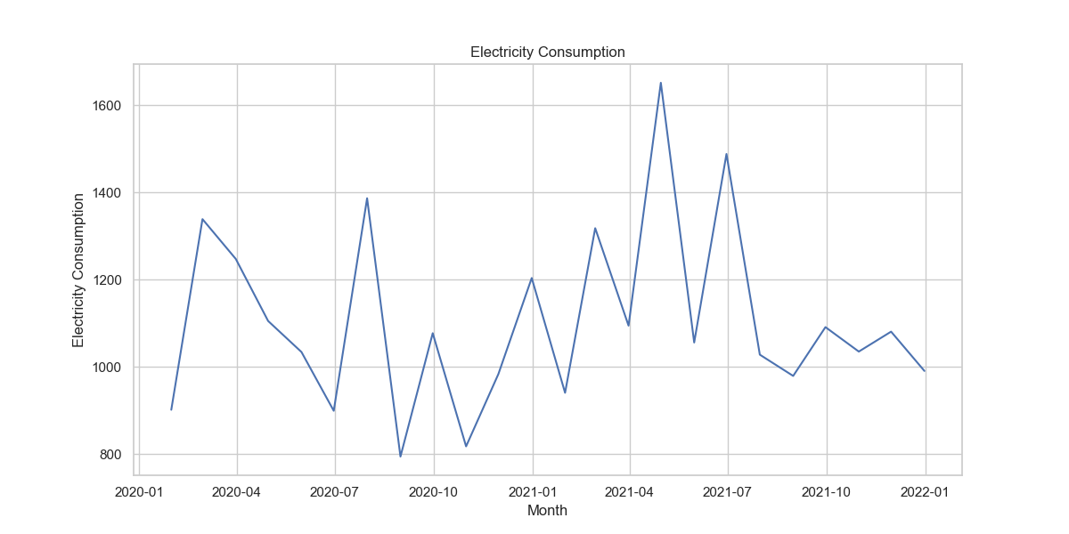
A time series analysis example could involve analyzing the monthly electricity consumption of a residential building. Imagine you are a building manager who wants to understand the electricity usage patterns and forecast future consumption to optimize energy management and reduce costs.
You collect the electricity consumption data for the past two years, which includes the monthly kilowatt-hour (kWh) usage for the entire building. You then perform a time series analysis to study the temporal patterns and forecast future electricity consumption.
In this process, you carry out the following steps:
- Visualize the Data: Plot the time series data to observe the general trend, seasonality, and any irregular fluctuations in the electricity consumption over time.
- Decompose the Time Series: Break down the time series into its trend, seasonal, and residual components to better understand the underlying patterns.
- Identify the Model: Determine the most appropriate time series model to capture the patterns in the data. This may involve using models such as Autoregressive Integrated Moving Average (ARIMA), Seasonal Decomposition of Time Series (STL), or Exponential Smoothing State Space Model (ETS).
- Forecast Future Consumption: Apply the chosen model to forecast electricity consumption for the upcoming months or years. This forecast can help you anticipate periods of high or low electricity usage.
- Evaluate the Model: Assess the model’s accuracy by comparing the forecasted values against the actual data. Refine the model if necessary to improve its forecasting performance.
Example:

By conducting a time series analysis, you gain insights into the electricity consumption patterns of the building and can make informed decisions about energy management strategies, such as adjusting heating and cooling schedules, implementing energy-saving technologies, or negotiating better energy contracts with utility providers.
This can ultimately help reduce energy costs and promote a more sustainable building operation.
Code sample:
import pandas as pd
import numpy as np
import seaborn as sns
import matplotlib.pyplot as plt
from statsmodels.tsa.seasonal import seasonal_decompose

# Set Seaborn theme
sns.set_theme(style="whitegrid")

# Create a synthetic dataset representing monthly electricity consumption
np.random.seed(42)
date_rng = pd.date_range(start='2020-01-01', end='2021-12-31', freq='M')
consumption = np.random.randint(800, 1500, size=(24,))
seasonal_effect = np.sin(np.linspace(0, 4 * np.pi, 24)) * 200
electricity_consumption = consumption + seasonal_effect

data = {
    'Date': date_rng,
    'Electricity_Consumption': electricity_consumption
}

dataset = pd.DataFrame(data)
dataset.set_index('Date', inplace=True)

# Visualize the data
plt.figure(figsize=(12, 6))
sns.lineplot(data=dataset, legend=None)
plt.title('Electricity Consumption')
plt.xlabel('Month')
plt.ylabel('Electricity Consumption')
plt.show()

# Decompose the time series
decomposition = seasonal_decompose(dataset, model='additive')
trend = decomposition.trend
seasonal = decomposition.seasonal
residual = decomposition.resid

# Plot the decomposition components
fig, axes = plt.subplots(3, 1, figsize=(12, 9))
axes[0].plot(trend)
axes[0].set_title('Trend')
axes[1].plot(seasonal)
axes[1].set_title('Seasonal')
axes[2].plot(residual)
axes[2].set_title('Residual')
plt.tight_layout()
plt.show()
6. Diagnostic Analysis
Diagnostic analysis focuses on examining data to identify the cause of a problem or issue.
By looking at the relationships between different data points and analyzing the factors contributing to the issue, diagnostic analysis can help organizations identify the root cause of a problem and address it effectively.
For example, a company might use diagnostic analysis to determine why a particular product line is underperforming and implement targeted improvements.

In this scatter plot, you can see that most data points follow a linear pattern, except for one point that is quite distant from the others.
This outlier can be visually identified due to its distance from the regression line. Diagnostic analysis could involve further investigation to understand the cause of this outlier and determine whether it’s an anomaly or error in the data..
Code sample:
import pandas as pd
import numpy as np
import seaborn as sns
import matplotlib.pyplot as plt

# Set Seaborn theme
sns.set_theme(style="whitegrid")

# Create a synthetic dataset with an outlier
np.random.seed(42)
x_values = np.random.rand(50) * 10
y_values = x_values * 2 + np.random.normal(size=50)
x_values_outlier = np.append(x_values, 8)
y_values_outlier = np.append(y_values, 30)

data = {
    'X': x_values_outlier,
    'Y': y_values_outlier
}

dataset = pd.DataFrame(data)

# Visualize the data with a regression line
plt.figure(figsize=(12, 6))
sns.regplot(x='X', y='Y', data=dataset)
plt.title('Diagnostic Analysis: Identifying an Outlier')
plt.xlabel('X')
plt.ylabel('Y')
plt.show()
7. Text Analysis
Text analysis employs natural language processing techniques to analyze textual data, such as social media posts, customer reviews, or news articles. This type of analysis can help organizations understand the sentiment behind the text, identify common themes or topics, and even uncover hidden insights.
Applications include sentiment analysis for understanding customer opinions, topic modeling for content categorization, or keyword extraction for search engine optimization.

Code sample:
# pip install textblob

import pandas as pd
import seaborn as sns
import matplotlib.pyplot as plt
from textblob import TextBlob

# Set Seaborn theme
sns.set_theme(style="whitegrid")

# Sample customer reviews
reviews = [
    "I love this product! It's amazing.",
    "The quality is great, I highly recommend it.",
    "I am very disappointed with my purchase.",
    "This product is just okay, nothing special.",
    "I had a terrible experience with this product.",
]

# Calculate sentiment polarity
sentiments = [TextBlob(review).sentiment.polarity for review in reviews]

# Create a DataFrame with the sentiment polarity
data = {
    "Review": reviews,
    "Sentiment": sentiments
}

dataset = pd.DataFrame(data)

# Visualize the sentiment polarity as a bar chart
plt.figure(figsize=(12, 6))
sns.barplot(x="Sentiment", y="Review", data=dataset, palette="coolwarm")
plt.title("Sentiment Analysis of Customer Reviews")
plt.xlabel("Sentiment Polarity")
plt.ylabel("Review")
plt.show()
8. Spatial Analysis
Spatial analysis deals with the analysis of geographic data, such as the location of stores, customers, or natural resources.
By identifying patterns or relationships within the data, spatial analysis can help organizations make informed decisions related to location-based factors.
For example, a retail chain might use spatial analysis to determine the optimal location for a new store, while a city planner might use it to analyze traffic patterns and optimize public transportation routes.

# pip install geopandas descartes contextily
import pandas as pd
import geopandas as gpd
import matplotlib.pyplot as plt
import contextily as ctx

# Sample store locations (latitude and longitude)
store_locations = [
    {"Store": "A", "Latitude": 37.7749, "Longitude": -122.4194},
    {"Store": "B", "Latitude": 37.8049, "Longitude": -122.4494},
    {"Store": "C", "Latitude": 37.7349, "Longitude": -122.3894},
]

# Create a GeoDataFrame with the store locations
store_data = pd.DataFrame(store_locations)
gdf_stores = gpd.GeoDataFrame(
    store_data, geometry=gpd.points_from_xy(store_data.Longitude, store_data.Latitude)
)

# Set the Coordinate Reference System (CRS)
gdf_stores.crs = "EPSG:4326"
gdf_stores = gdf_stores.to_crs("EPSG:3857")

# Load a shapefile with San Francisco city boundaries
url = (
    "https://data.sfgov.org/api/geospatial/wkhw-cjsf?method=export&format=Shapefile"
)
city_boundary = gpd.read_file(url)
city_boundary = city_boundary.to_crs("EPSG:3857")

# Visualize the store locations on a map of San Francisco
fig, ax = plt.subplots(figsize=(12, 8))
city_boundary.boundary.plot(ax=ax, linewidth=1, edgecolor='black', zorder=2)
gdf_stores.plot(ax=ax, markersize=100, column="Store", cmap="coolwarm", marker="o", label="Store", zorder=3)
ctx.add_basemap(ax, source=ctx.providers.CartoDB.Positron, alpha=0.8, zorder=1)

# Customize plot appearance
ax.set_title("Store Locations in San Francisco", fontsize=16, fontweight='bold')
ax.set_axis_off()
ax.legend(loc='upper right', markerscale=0.5)

plt.show()
Conclusion
Data analytics has become an essential tool for businesses and organizations in making informed decisions and staying competitive in today’s data-driven world.
By understanding the different types of data analytics — descriptive, inferential, exploratory, predictive, prescriptive, diagnostic, text, and spatial analysis — you can better appreciate the power of data and its potential to impact our daily lives.
Whether it’s through improving customer experiences, optimizing business processes, or uncovering hidden insights, data analytics is a powerful tool that can help organizations across various industries thrive in the modern digital landscape.
As technology continues to advance and the amount of available data grows exponentially, the importance of data analytics will only increase, making it an essential skill for professionals across various fields.
Looking to leverage AI for faster data analysis? Give skills.ai a try for free and generate comprehensive data analytics reports and presentations in just minutes.